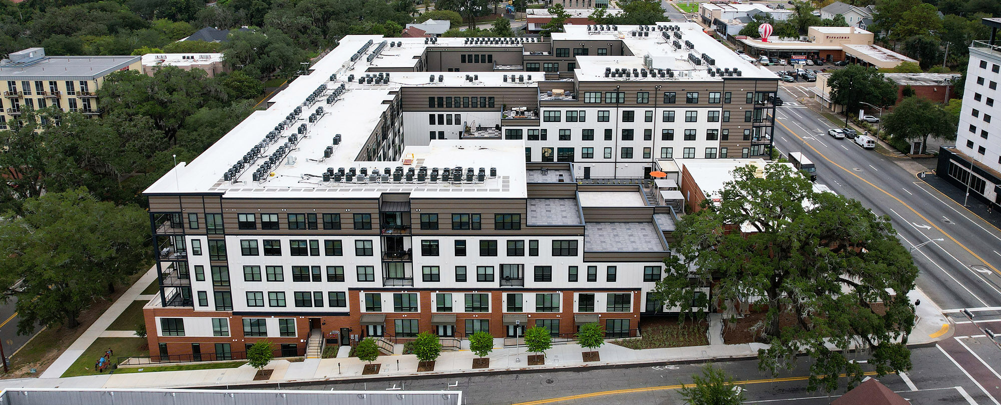
It’s true: They just aren’t making any more land. Builders and developers are pressured to get increasingly more creative with each new project since the price of land continues to escalate. Maximizing lot premiums without overshooting the target price point presents a new challenge in nearly every product type. But some projects prove that great design can make the most of any lot size.
Carving Out a Niche
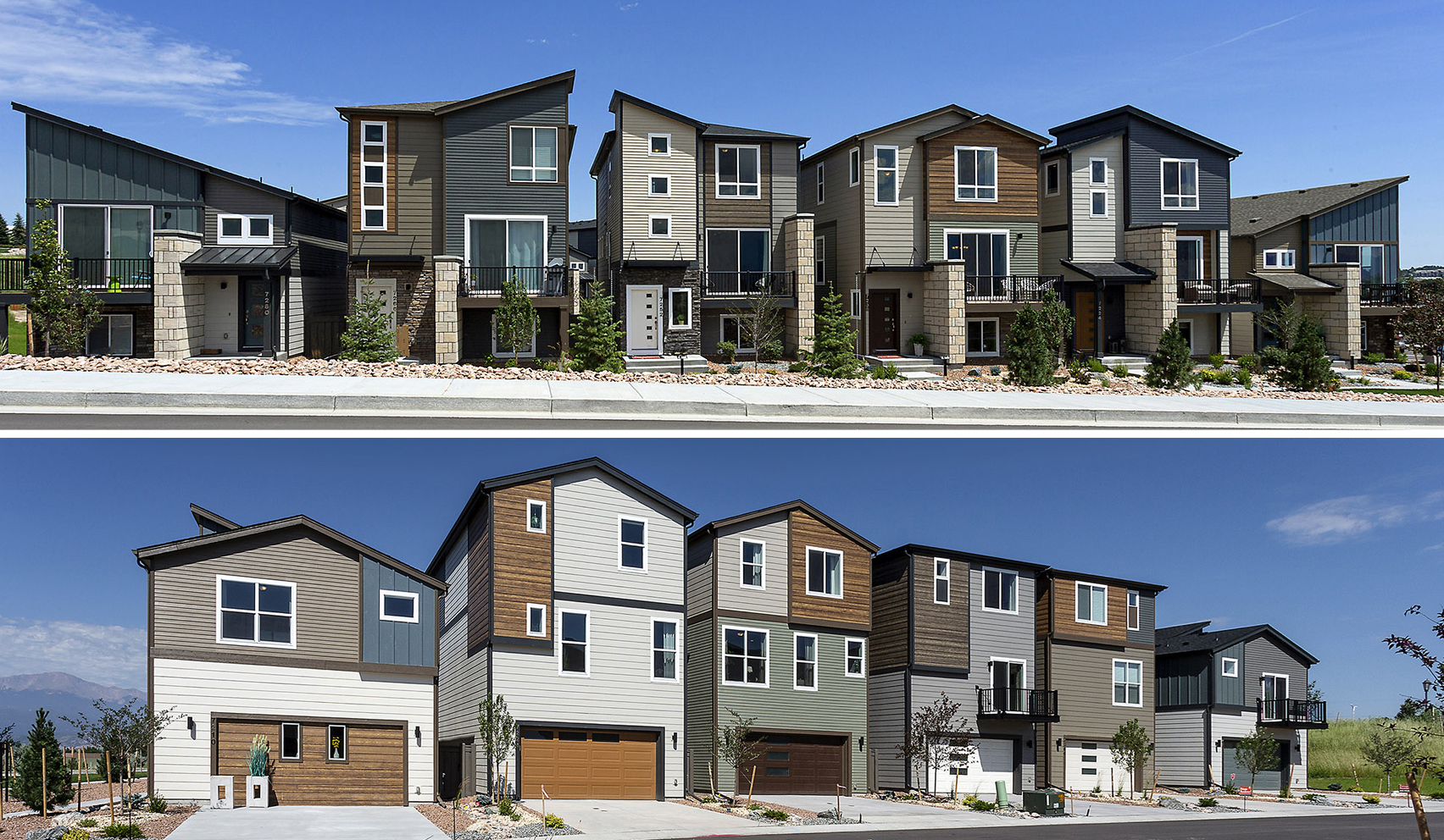
At only 22′ wide, the Midtown Collection is right at home in its narrow-lot category. Thanks to a terrific collaboration between BSB Design and the architecture team at Classic Homes, the elevations and floor plans of the Midtown Collection became something spectacular. Exteriors have a strikingly contemporary look highlighted by contrasting materials and colors applied to clearly modern forms, like shed roofs and substantial vertical elements wrapped in stone. Each home is distinct from the others, carving out a niche on its own narrow parcel. Inside, homeowners will quickly forget that these plans are only 22’ wide.
Designers leveraged volume where they could, introduced lots of windows (including on all three levels of the stair tower) and made sure each room lived the full width of the home. The narrow width actually created some design freedom; since all spans were manageable, the architects were free to move walls where they worked best, generally keeping primary spaces open for the full width of the home and placing closets, circulation and other necessities in corners or alcoves.
Narrow Lot Luxury
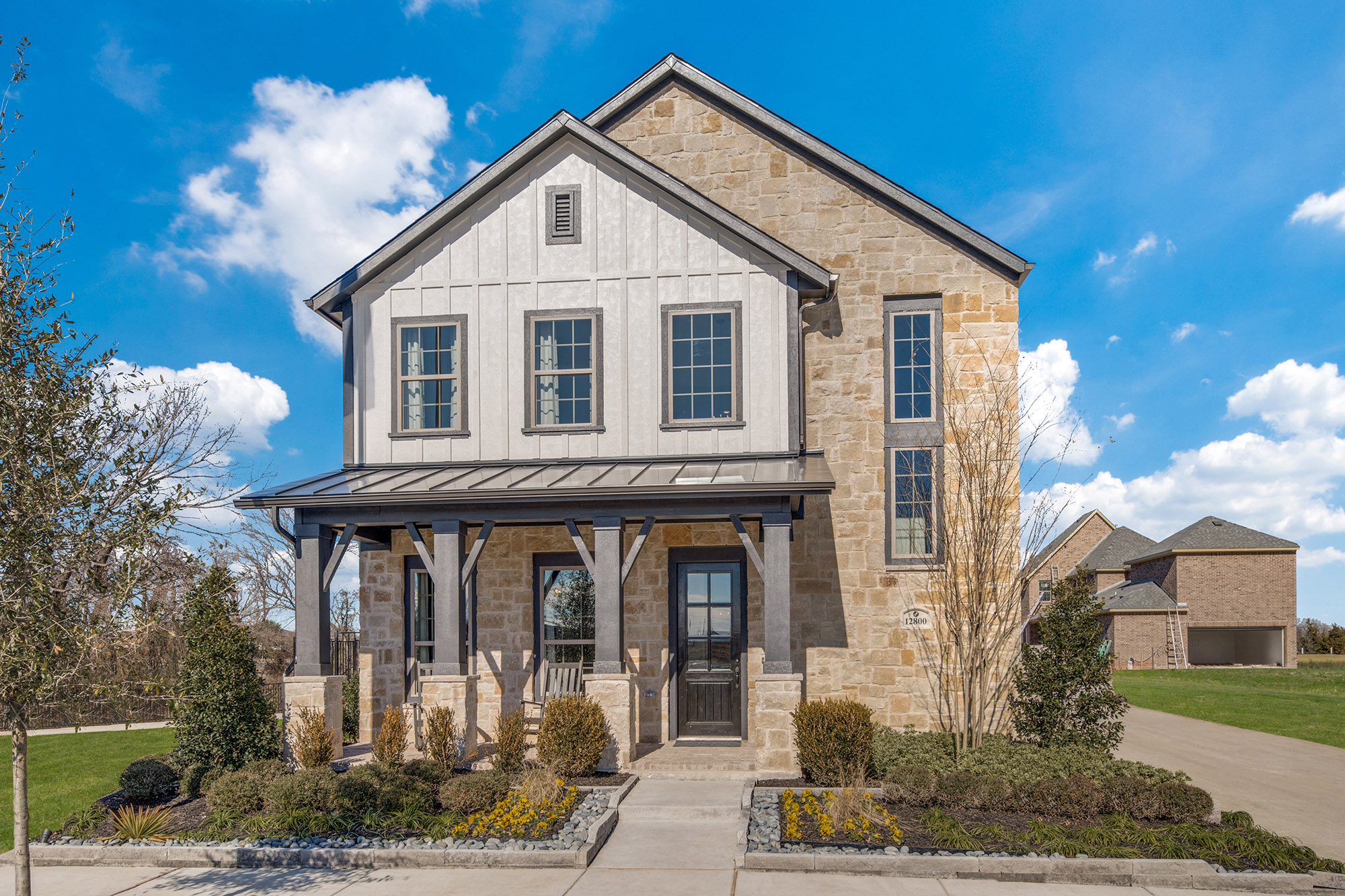 It seems contradictory, but at Edgewood in Frisco, TX, living large means going small. On lot sizes that average 35’ wide, Normandy Homes has introduced high-end homes perfect for move-up buyers. Doing so, however, meant that design had to take center stage to ensure each home provided the look and lifestyle these buyers demand even though the lots are narrow. The team started with authentic elevations marked by rustic materials and contrasting colors. The main massing is fully clad in stone, accented by the steel porch roof and dark, distinctive trim color. Inside, the two-story foyer of the Paloma model opens to a fully functional lifestyle-driven floor plan, with a luxurious kitchen taking center stage at the heart of the home. Casual living spaces include lots of light thanks to additional two-story volume in the family room, with the upstairs loft capturing more of that light above. Room arrangements allow strategic window placement, including high glass, that floods interiors with daylight, helping the entire plan live like a much larger house.
Parking Before Design
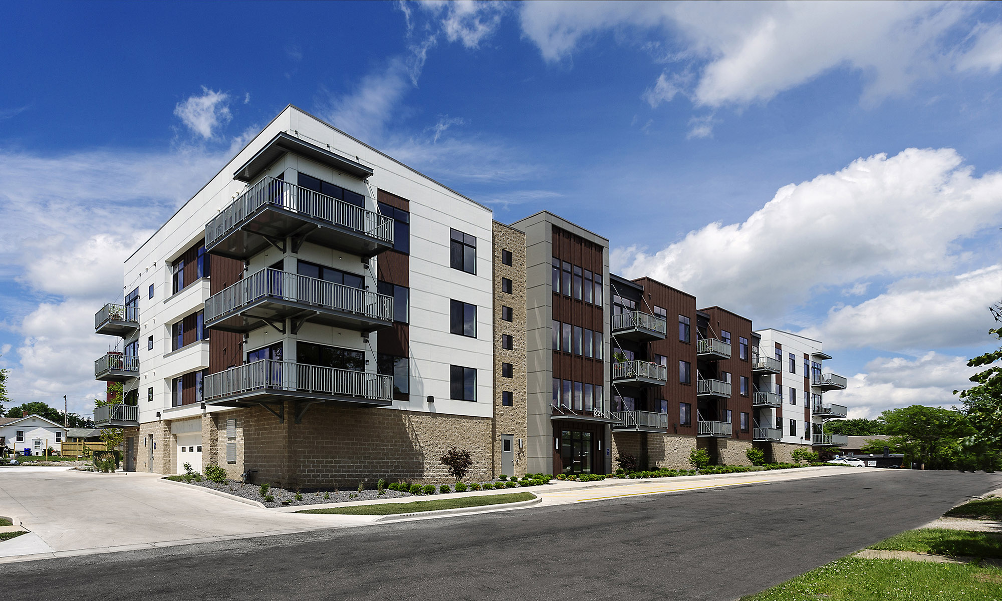
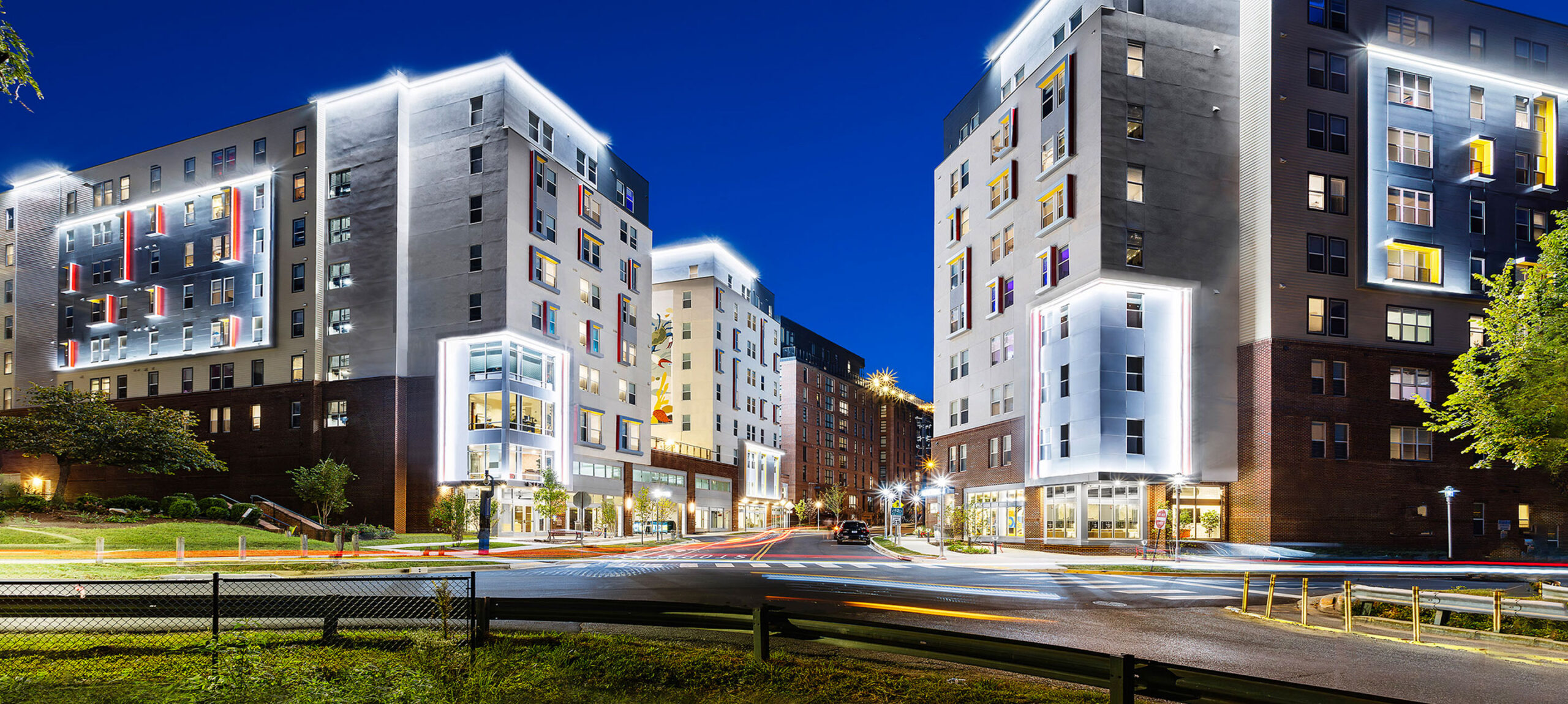
To maximize a modest infill site, developer Larry Herman utilized a podium design for his newest boutique condominium project. This enabled the project to achieve the necessary parking ratios without jeopardizing additional parcel square footage for surface parking. The podium meant a smaller building footprint could be used, which led to a design-focused elevation that made the most of the building’s scale to deliver a dynamic street presence. Finding a design solution that solved the parking dilemma allowed the team to work within the confines of the small infill lot without letting it restrict their design creativity. The result is a building that feels perfectly suited to its location, with residential proportions that create a welcoming, inviting vibe.
These projects were featured in Volume 09 of our inspire magazine. Check it out here!

