Architecture is typically discussed in terms of form, function and structure. Yet, amidst the concrete and steel, there lies a subtle yet powerful element that can transform spaces and evoke emotions – color. While architects traditionally focus on the physical aspects of design, the question arises: Can color be considered an important part of architecture?
Haven at the Gulch: A Statement in Urban Landscape

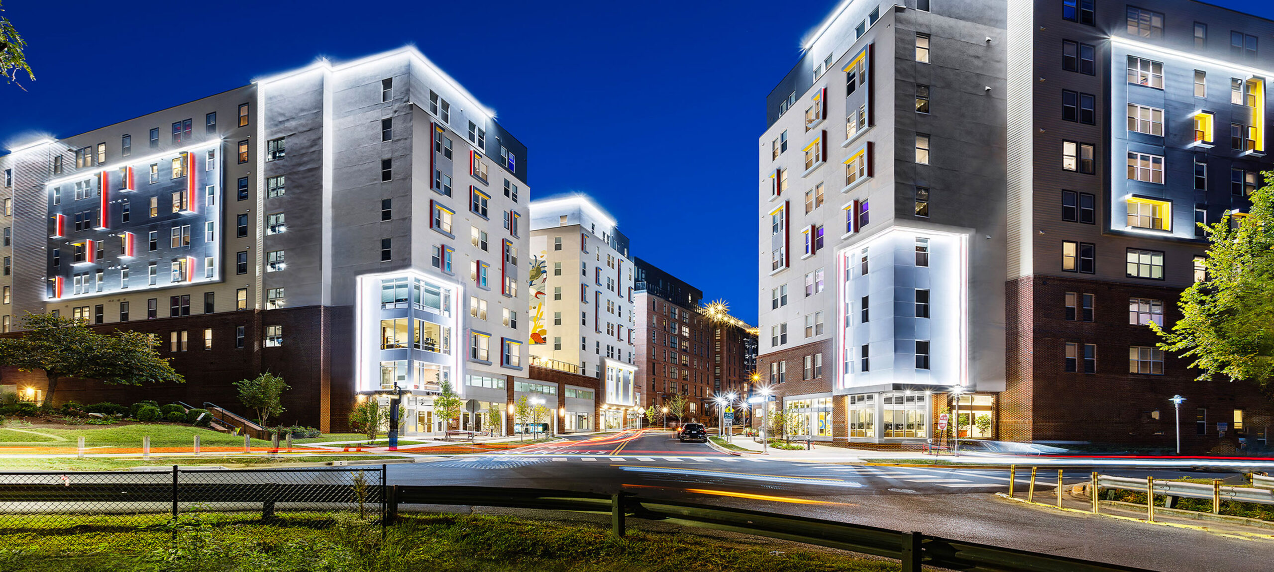
In the bustling urban setting of Haven at the Gulch, color is strategically utilized on the exterior to add movement and distinctiveness. The carefully chosen palette brings the building’s simple structure to life, enabling it to stand confidently next to a towering 22-story neighbor. This thoughtful application of color demonstrates how even subtle exterior enhancements can significantly impact a building’s presence and character in a dense cityscape.
Canyon Flats: Vibrancy and School Spirit

At Canyon Flats, color takes on a different role, celebrating the vibrancy and spirit of school life. The use of the school’s colors in the building’s design not only adds visual appeal but also fosters a sense of community and belonging among the students. Canyon Flats exemplifies how color can be a powerful tool in creating an environment that resonates with its residents’ identity and culture.
Bayswater: Color Harmonizing with Environment
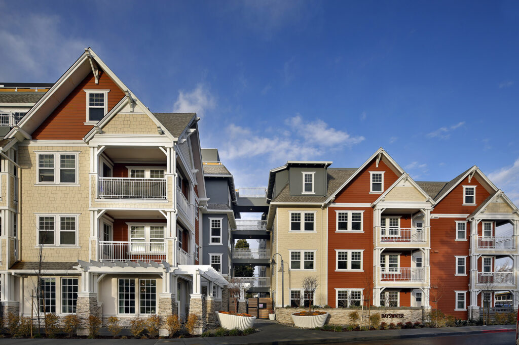
Bayswater showcases the power of color to enhance architectural form and integrate with the environment. The thoughtful selection and placement of colors on the exterior not only highlight the building’s architectural features but also integrate it seamlessly into its residential surroundings. The use of color in Bayswater demonstrates how a well-considered palette can transform basic structures into iconic landmarks.
Sterling Grove Villas: The Elegance of Simplicity
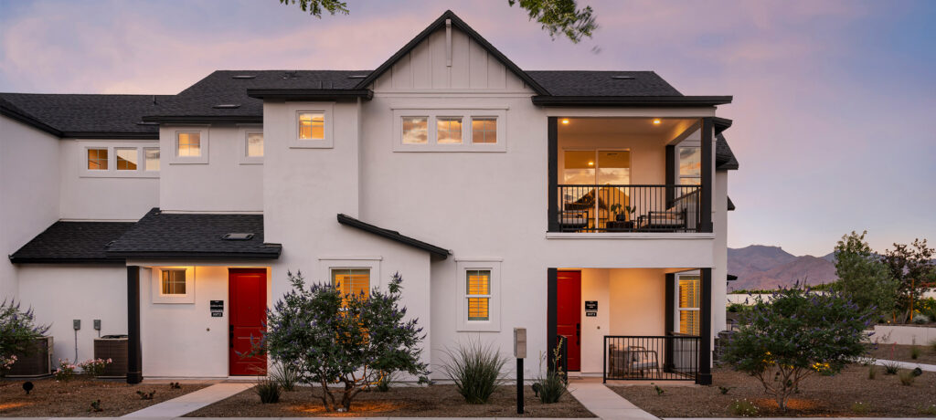
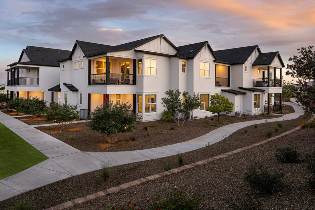
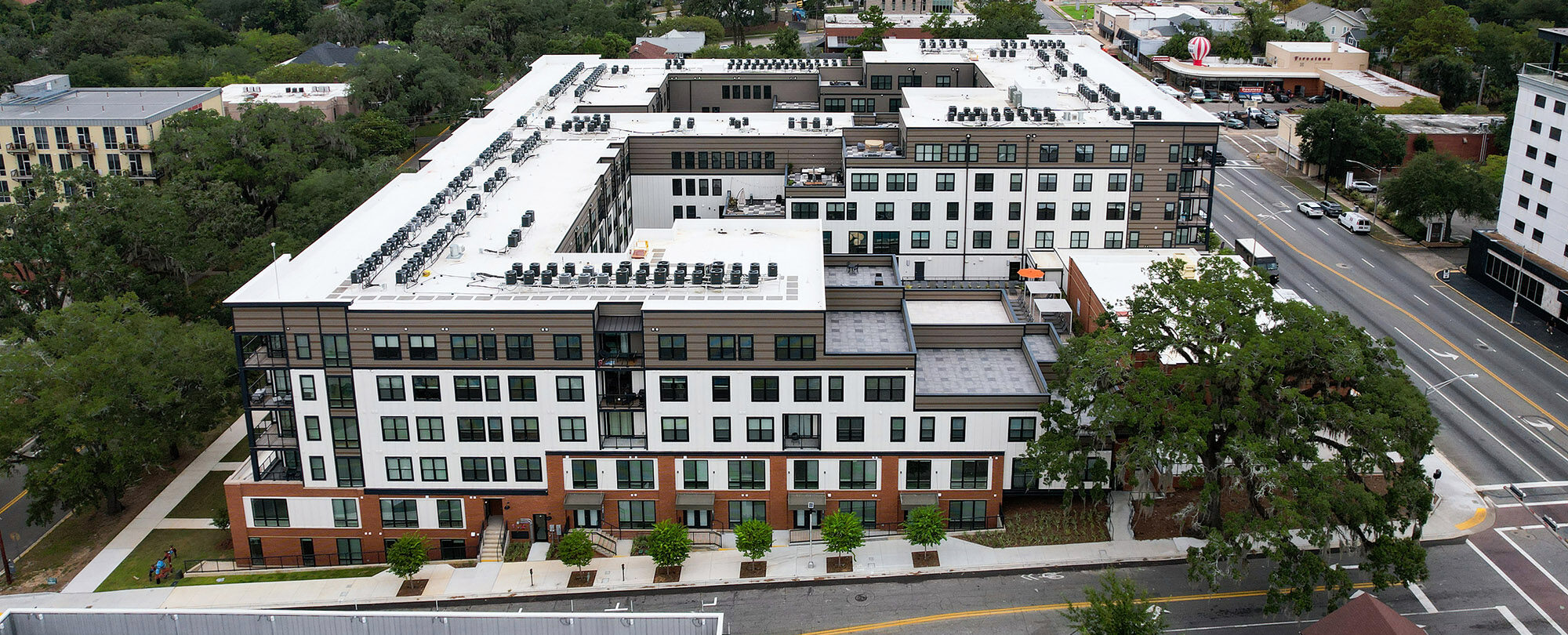
Sterling Grove Villas showcases the power of minimalism in color use. The stacked flats uses mainly whites and neutrals, highlighting the clean lines and modern design of the villas. This simplicity in color gives the development a timeless and elegant look. What sets Sterling Grove apart is its strategic use of color highlights. Red doors stand out against the neutral backdrop, adding character and a distinct identity to each unit. This approach proves that even minimal color use, when applied thoughtfully, can have a significant impact on architectural aesthetics.
These projects illustrate that color is much more than a final touch in architecture; it is a crucial component that shapes experiences and enhances aesthetics. Whether it’s adding movement to a building, echoing cultural vibrancy, or harmonizing with the environment, color is an integral element alongside architecture. It becomes a key tool in transforming structures into captivating, functional and emotionally significant works of art.
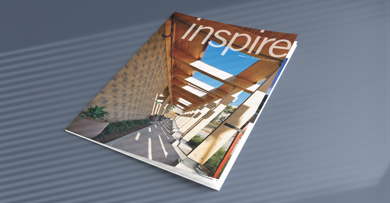
These projects were featured in Volume 13 of our inspire magazine. Check it out here!

