Blurring Lines Between Architecture & Interiors
Effective student housing design can harness the essence of an educational institution as it provides opportunities for residents to maximize their college experience. As one of the first “on their own” living environments for many students, a great community can help form the sort of lifelong memories that will cement the legacy every institution hopes to perpetuate.
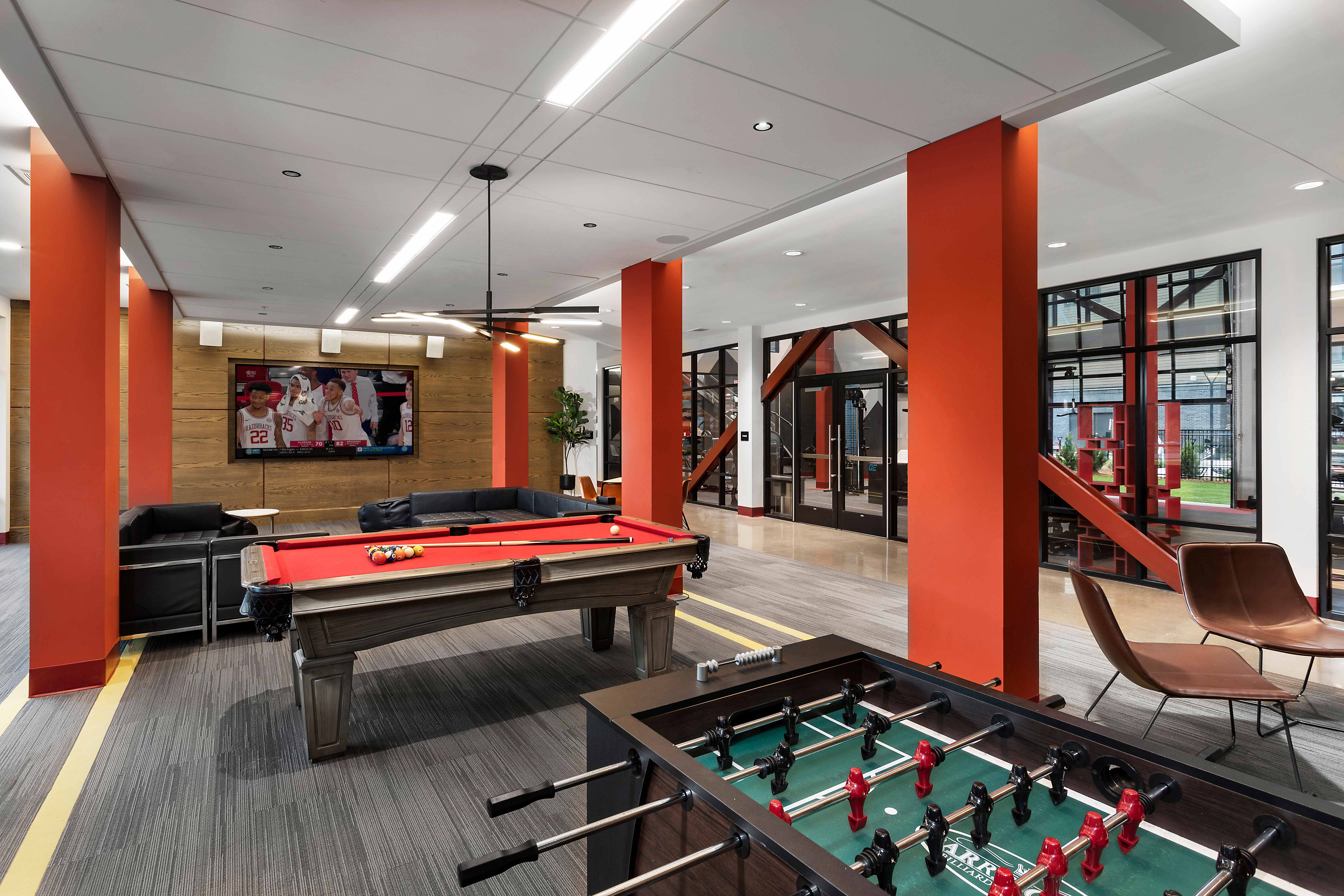
The Marshall Fayetteville represents just such a confluence of functionality, design aesthetic and local identity that establishes it as a premier community near the University of Arkansas student. The interwoven backstory informs high impact, engaging outward facing amenity spaces, and secondary resident areas placed in a subdued setting are ideal for study and relaxation. And throughout the design, myriad references to the university’s mascot offer an undeniable brush of whimsy.
Architectural styling is reminiscent of repurposed industrial buildings that are common in the region. Carbonized brick and structural steel reinforce this identity, and the interior design pulls outward to connect with that story and blend it with a unique, historically-inspired geometry and color that plays out throughout the community. 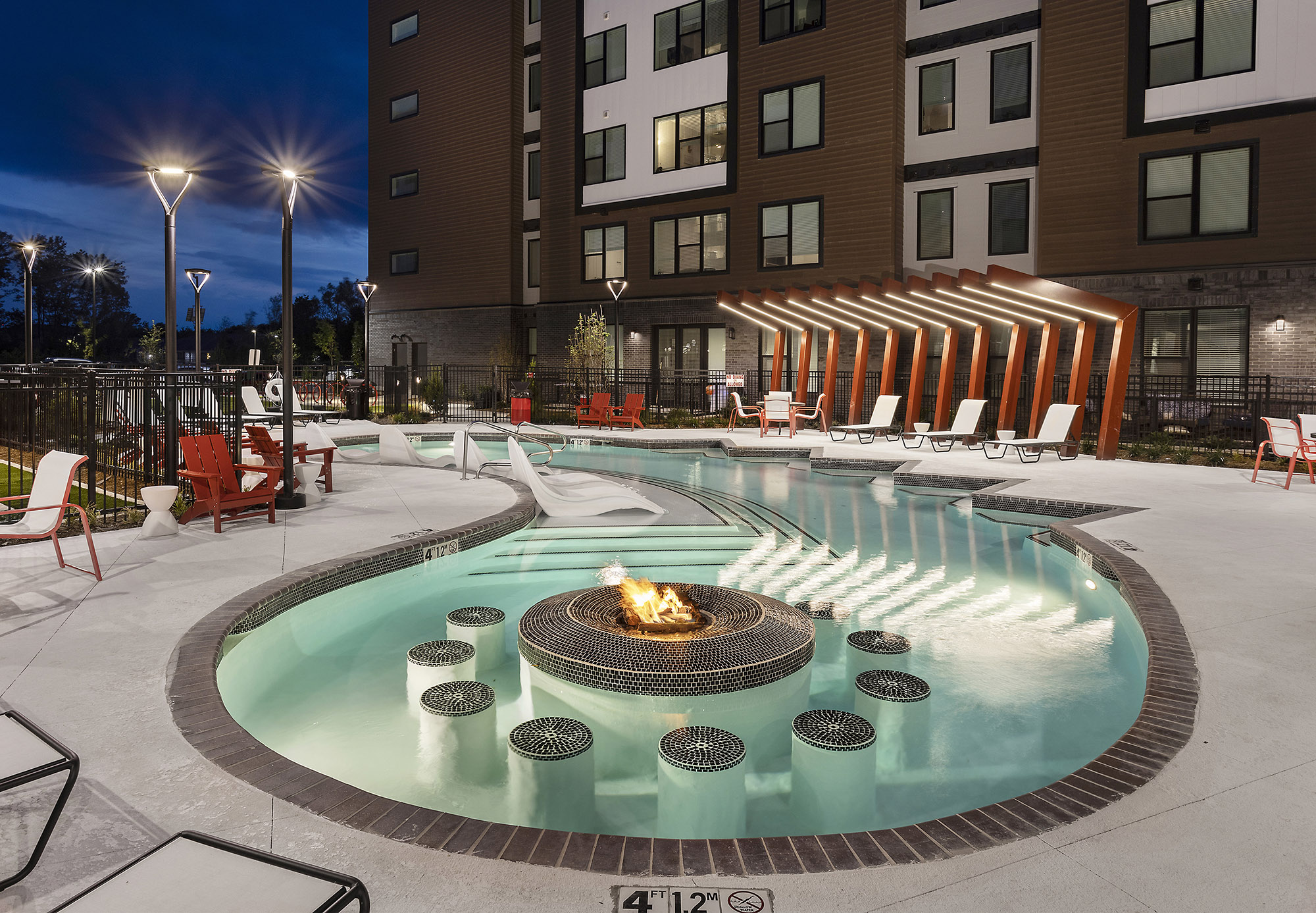 The iconic razorback provides emotive inspiration in strategic ways, starting with the unmistakable shape of the courtyard swimming pool, complete with in-water fire table and seating. The striking, angular nature of the wild boar’s ridgeline is reflected in the poolside steel pergolas and accent lighting at the grilling patio. Even the sloping Adirondack chairs imply the silhouette of a running razorback.
Designers elaborated on the razorback theme to introduce dynamic visual elements throughout the interior. A bold crimson hue highlights these details, paying homage to university colors while adding an intentional punch of vibrancy. Views into the building offer intriguing glimpses that set the stage for guests and residents. That experience starts at the two-story lobby, standing proud of the primary façade in a tower of black brick and glass. This striking element creates an intuitive wayfinding solution for the entry.
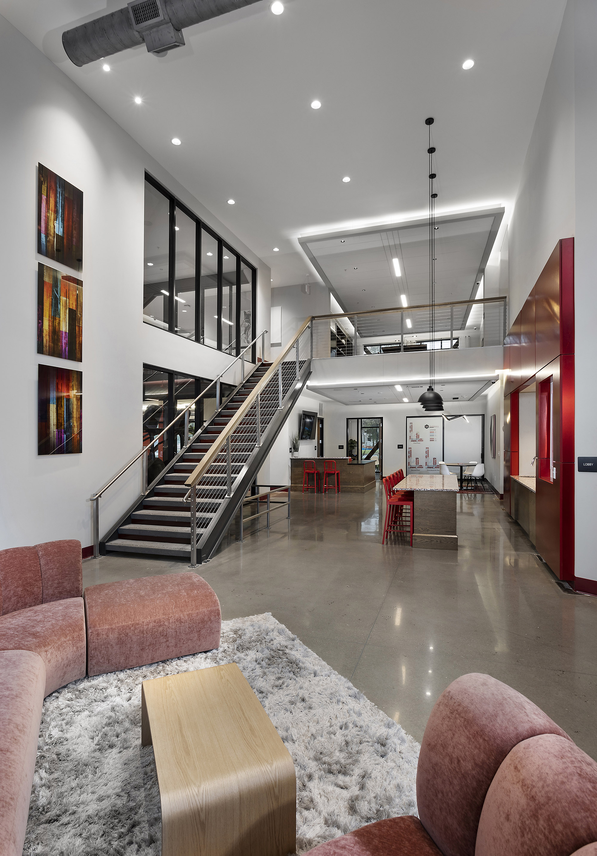 Impressive volume frames several key amenity areas in the lobby, including the concrete tread stair with cable rail leading to the second floor library overlook. Glass views display the fitness area to the left, elevators are on the right, and the leasing center and concierge desk are central, easily visible and accessible.
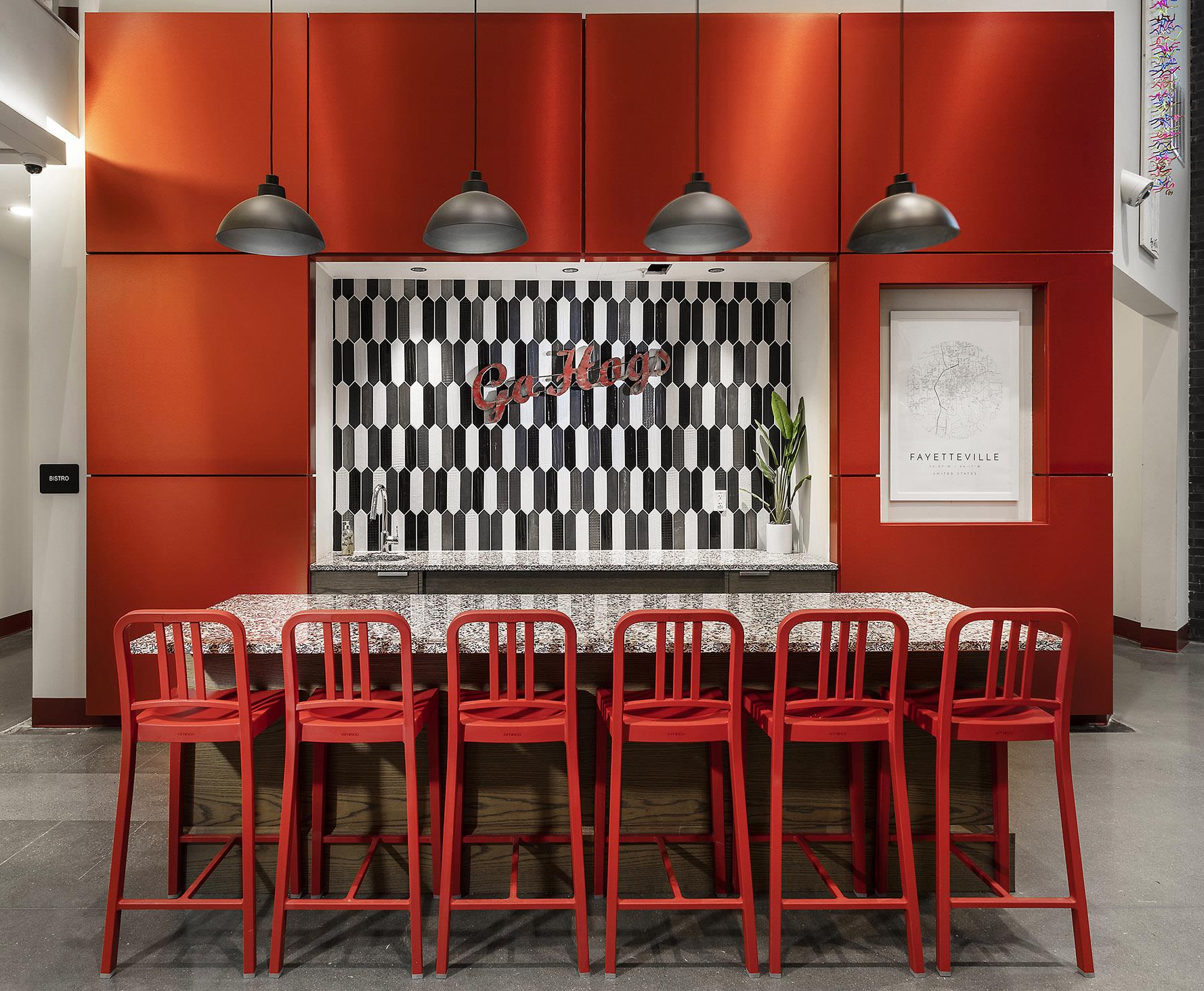
A highly functional casual café is located at the northeast corner of the building, sited to take advantage of the main route residents take to and from campus. Here, structural columns are wrapped in red panels with a white oak counter floating in between to create an innovate bar-style seating area, complete with USB power. A graphic wall covering in the side room displays an embellished, freeform stroke of red against a black background, repeating the highly charged, active emotion that celebrates the spirit of the razorback.
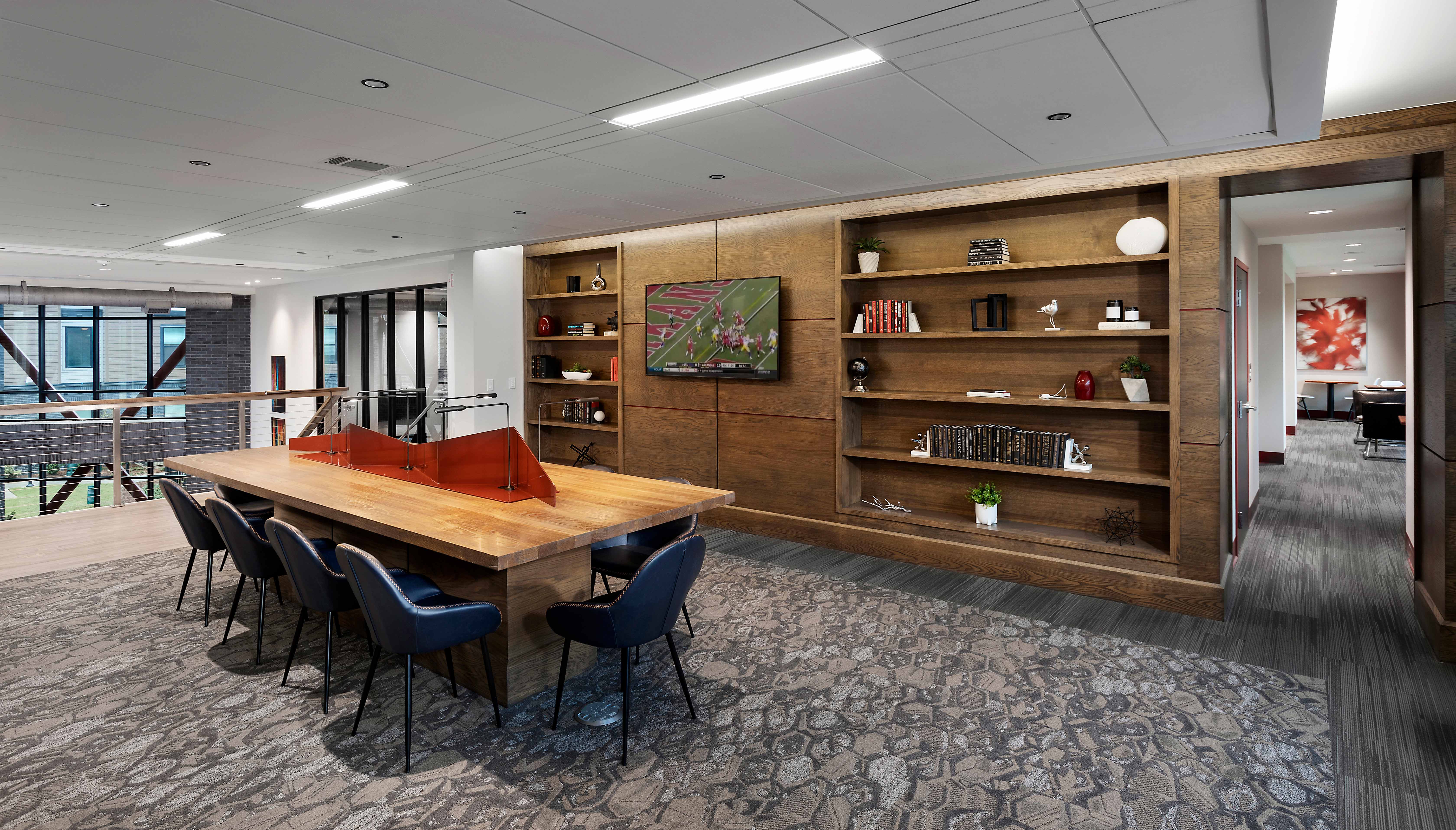
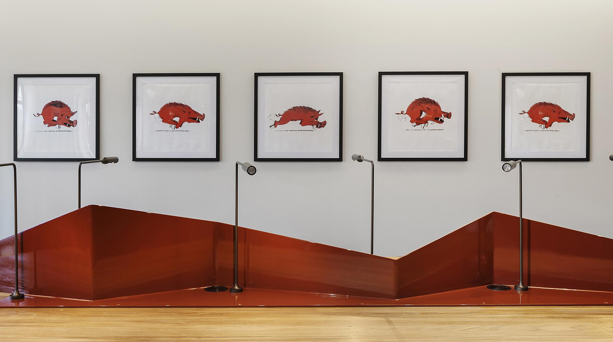
The library illustrates how The Marshall Fayetteville interior design recognizes and celebrates the area’s rich history while pushing it boldly forward. Traditional white oak millwork gives way to a feature furniture piece in the center of the room. Like so many historic libraries, the table is subdivided into individual study spaces. But here, a dynamic metal divider rises and falls like the spiked fur on the razorback. Individual reading lights and power outlets are provided, and the table is backed by a collection of 1930s cartoon artwork depicting the mascot running, back raised and angled like so many elements of the interior design.
In contrast, more neutral, calming tones are used in a variety of study spaces throughout each floor. Micro pods with glass doors and textured materiality offer enhanced acoustics for individual or partner study. Co-labs have amazing views and varied configurations. Casual seating is intermixed with tables and desks so each resident can find their ideal study environment. Throughout each space, instances of angular artwork, paint, flooring and wall coverings weave the story of the razorback throughout the entire resident experience.
For example, angles create a simple but highly effective way to break up the long (sometimes 350+ feet) run of hallway. Since rainwater leads extend through corridors, designers wrapped the pilaster bulkhead using three different angled treatments in bold red. Alternating these left to right is a playful way to reinforce the same language used in common areas.
Every amenity area of The Marshall Fayetteville echoes the design story of the razorback. Its angles, bold color and vivacious spirit are omnipresent and have set this new development apart from the competition.
