Multifamily projects are sometimes scaled down from their original designs. As costs increase, more and more design features run the risk of being eliminated. Enhanced detailing on a rent-only property doesn’t seem to generate any proven ROI, so what’s the point?
Design is in our name; it’s just what we do. So when we have the opportunity to collaborate with a client interested in going above and beyond with design, we are fully on board. The biggest challenge is executing our design vision within the available budget.
MOSAIC AT LEVIS COMMONS
Mosaic at Levis Commons is a large-scale multifamily project located in Ohio with design-heavy features. It’s not common to see this much detail in a rent-only building type, so the project is immediately eye-catching. Maybe the most surprising part is that these details were all within budget.
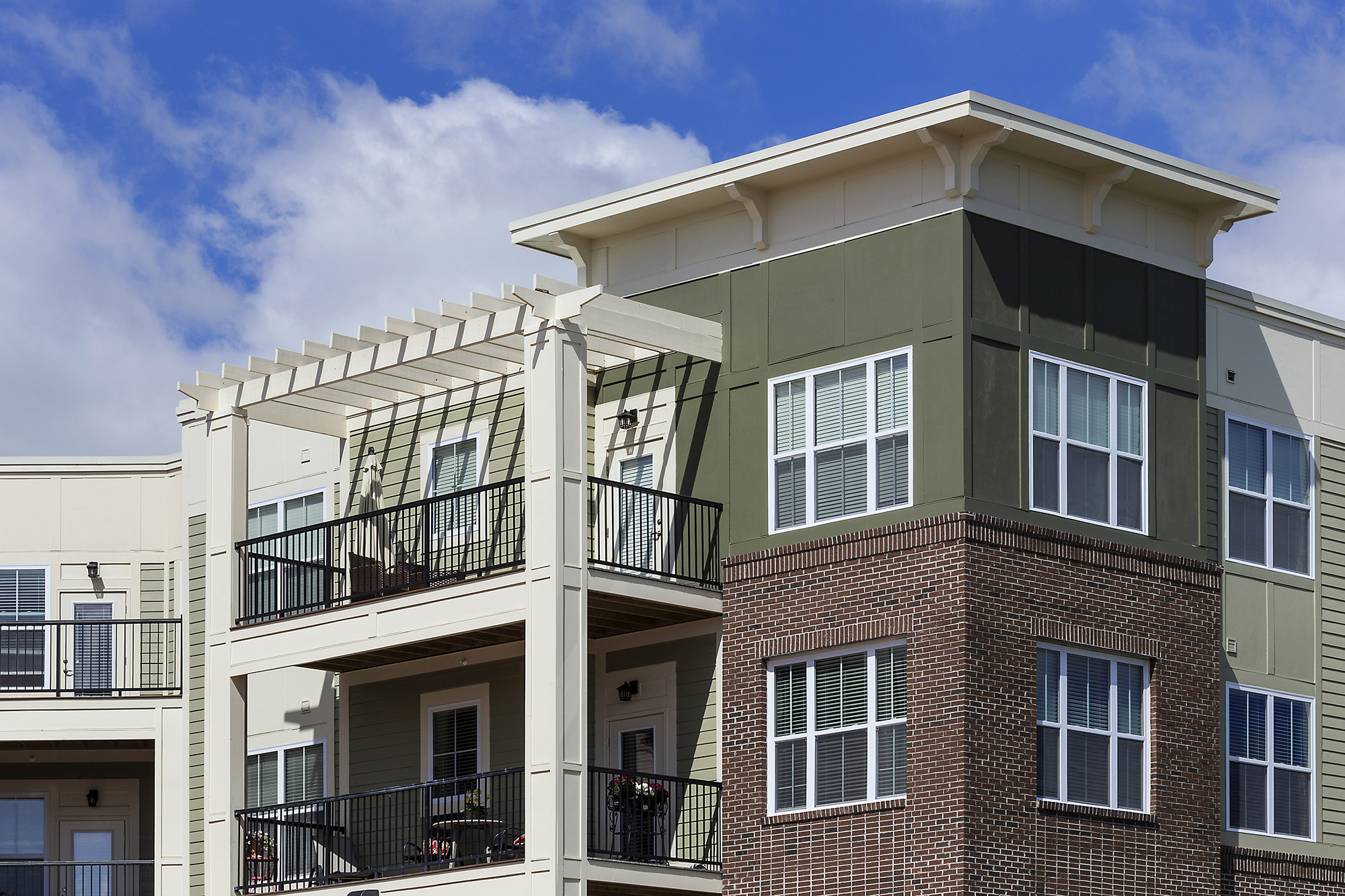 The goal was to make the building feel like a modern interpretation of the Italianate style. Some key details included the cornice element wrapping the roofline, pergolas on top floor balconies and plenty of brackets. They all came together with a simple yet sophisticated feel.
The initial design included roofs above each of the top floor balconies which pushed the budget more than anticipated. Instead, some were replaced with sun terraces. This cost-reduction strategy actually created interest and helped the building appear less top-heavy, resulting in a great-looking elevation.
The mix of materials and colors adds additional interest to the façade. Split-faced CMU block is used around the majority of the building, then adhered stone highlights the main entrance and signage. This strategic cladding choice created cost savings without sacrificing the overall look.
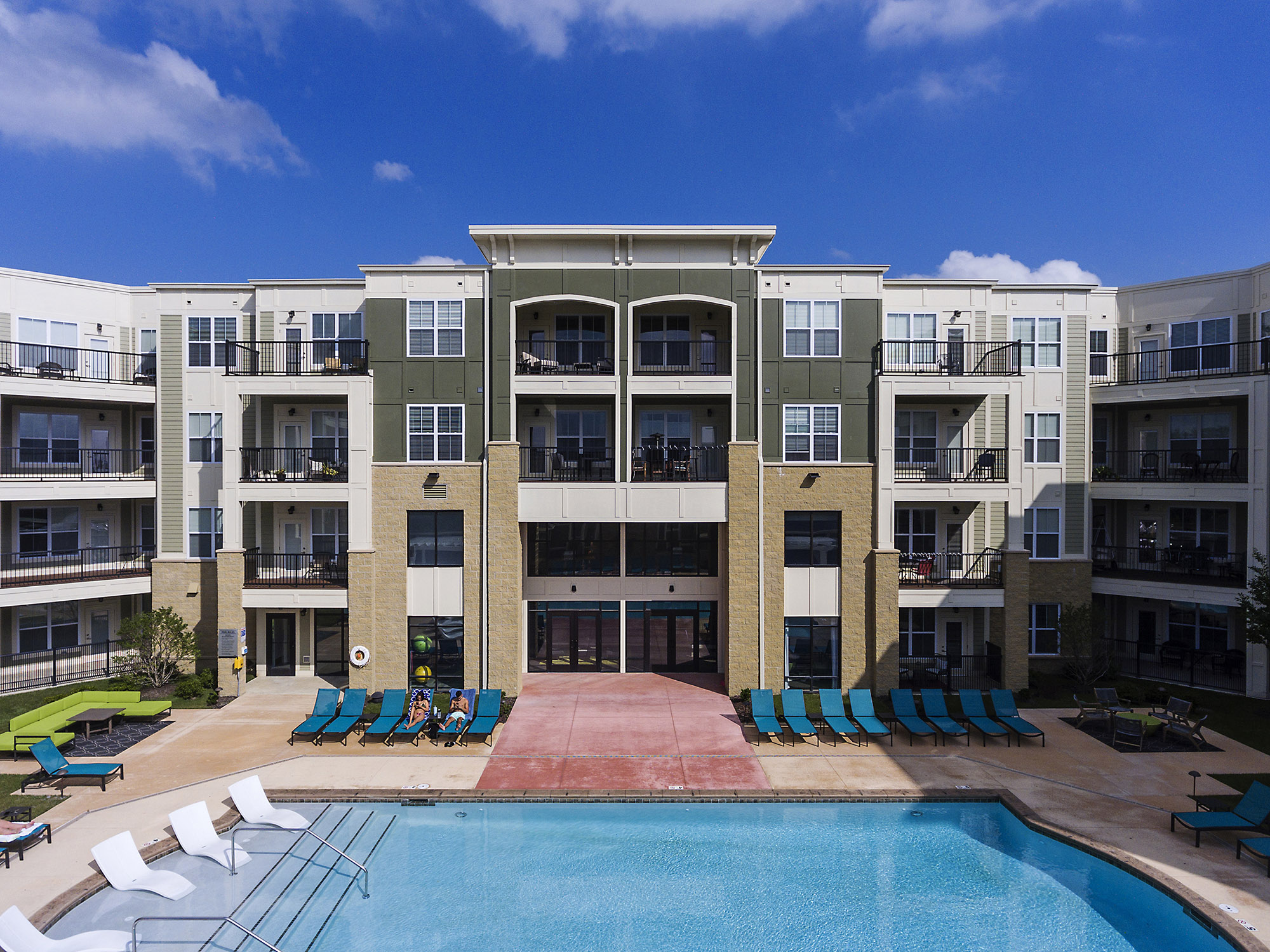 On the rear of the building, removing the roofs from some of the top-floor balconies meant fewer columns and materials were needed, which further reduced costs. Split-faced CMU block was also used as one of the main materials on the rear elevation, along with a variety of siding and colors that match the streetscape but are a bit less detailed. This variety establishes a high design feel without overdoing it.
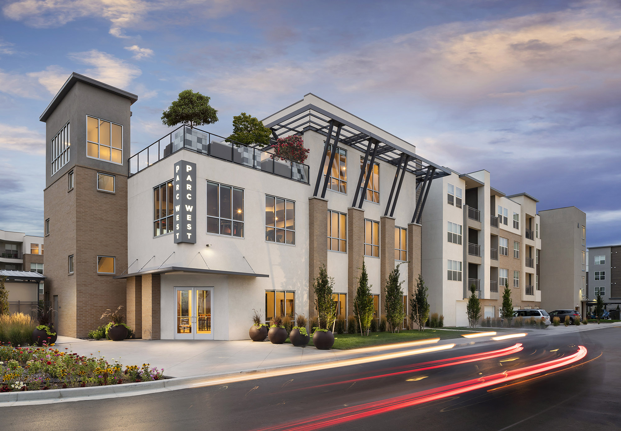
PARC WEST
In early development stages, our client planned to apply for tax credits to help finance a portion of the building designated to affordable housing in this luxury multifamily project. This initially helped balance some of the costs, and that balance was maintained even as the program goals shifted.
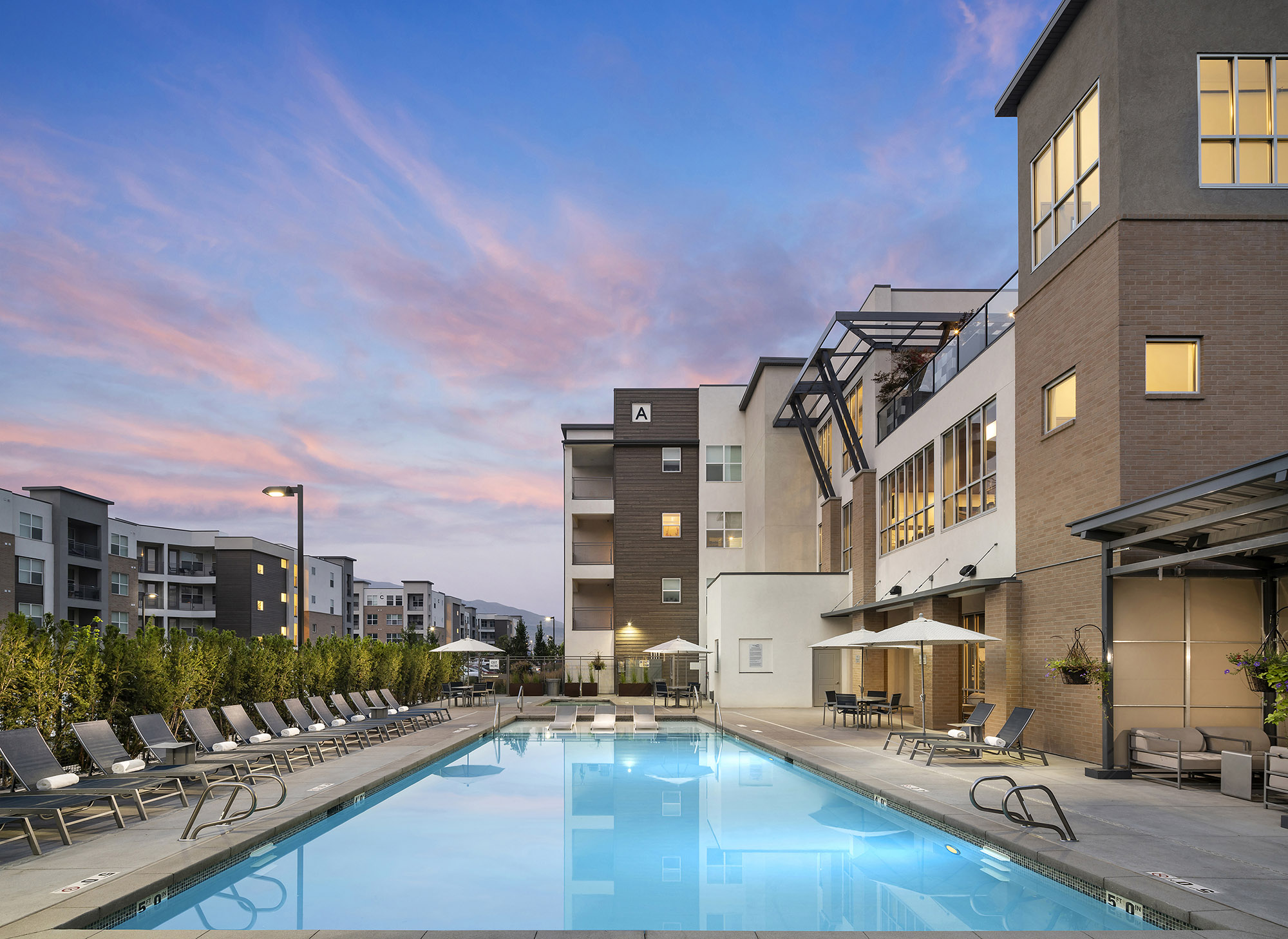 The modern design was achieved by using stucco as the main element, which is affordable yet popular in the area. To create depth, brick was added to building projections, while the wood lap siding was more of an accent design element. Large steel awnings on the clubhouse portion of the main building effectively scaled down the elevation with an eye-catching design component. The building envelope wraps around each balcony to offer shade and privacy.
Parc West proves that you don’t need an out of the ordinary design to really stand out. By using common materials in an atypical way, key design features are highlighted without breaking the budget.

