Meeting the needs of those who are at risk of or currently experiencing homelessness is a noble endeavor, one that requires considerable effort even before the first conceptual drawing is submitted to the City. In California in particular, affordable housing communities leverage exceptional architecture and design detail to rise above the national stereotype of “affordability = low quality”. This means design teams must be diligent in presenting stylistic concepts that not only look great within the context of the community but also remain efficient to build and operate, ensuring long-term solutions that can ultimately change lives.
CORNERING CREATIVITY
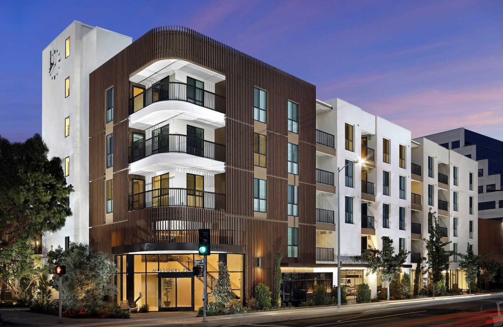
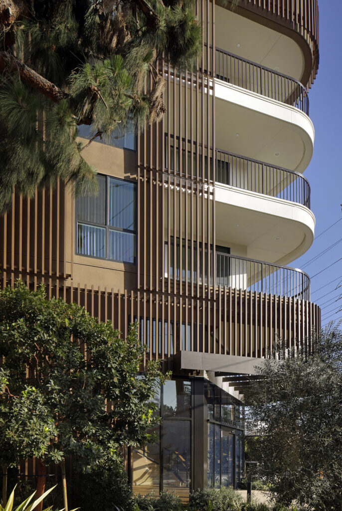
In West Los Angeles, this PCBC Gold Nugget winner leveraged the site’s highly visible corner to create an unforgettable memory point at the main entry. Missouri Place brought 74 units of 100% affordable housing to this upscale community, fulfilling the team’s vision of high design while integrating this desperately needed housing type into the greater community. Residents can be proud of the architectural detailing and building layout that maximizes community interaction.
At the street, engineered cypress louvers wrap a distinctive curved corner. This iconic element establishes the tone for the entire building, giving way to a stair tower on one side and a simple but effective pattern of recessed balconies and vertically aligned windows on the other. By incorporating some variation in the primary wall plane, designers activated the relatively simple building form and created a visually dynamic street presence. Also, the C-shaped building layout enabled a modest but highly valued interior courtyard, complete with lush landscaping, for an oasis of breezes, greenery and sunset views – right within the heart of this busy urban area.
BLOOMING WITH SMART GROWTH
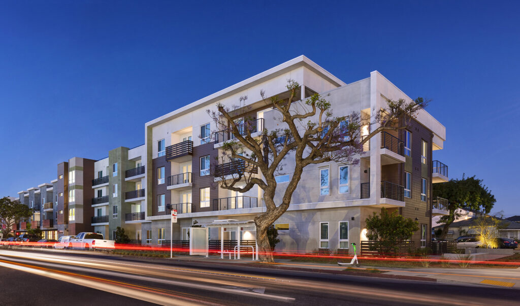
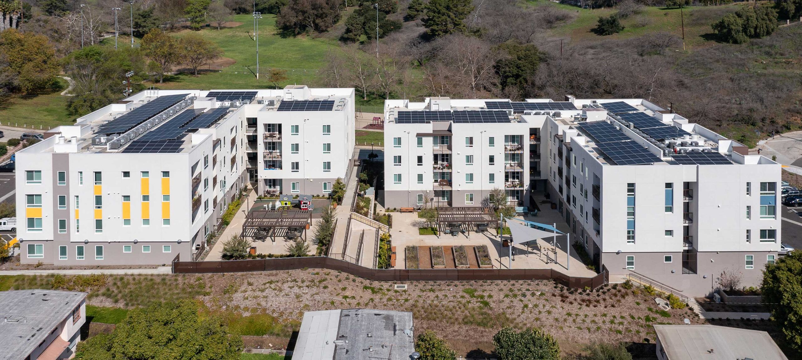
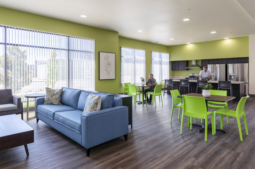
On this small infill site, big design creates a unique affordable housing solution offering 40 residential units and a full array of supportive services and facilities. Bloom at Magnolia blends efficient Type V construction across the three and four-story complex with interesting architectural forms featuring highly articulated front and rear facades. The program is anchored by 6,000+ sq. ft. of amenity areas and common space, plus additional outdoor areas on the roof with community gardens. The entire building illustrates an effort to engage residents with their community and with one another.
Architecturally, the modern design integrates a variety of forms and key massing elements to generate visual interest and to expand opportunities for light and airflow. A balance of texture and color creates additional appeal, establishing the building as a single design expression that maintains a decidedly residential scale across the entire street front. Every design component works to unify the building while avoiding monotony, like alternating balcony treatments and towers of banded color. These design elements work together to help Bloom at Magnolia feel like an established part of this redevelopment area. Residents and neighbors alike will appreciate the lasting value and positive impact of the new building.
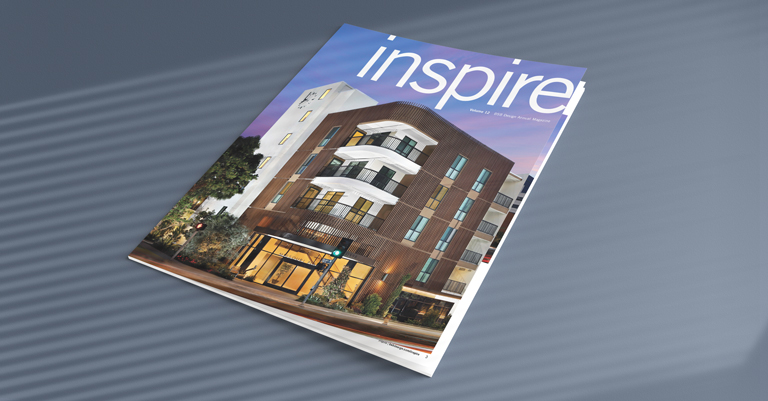
These projects were featured in Volume 12 of our inspire magazine. Check it out here!

