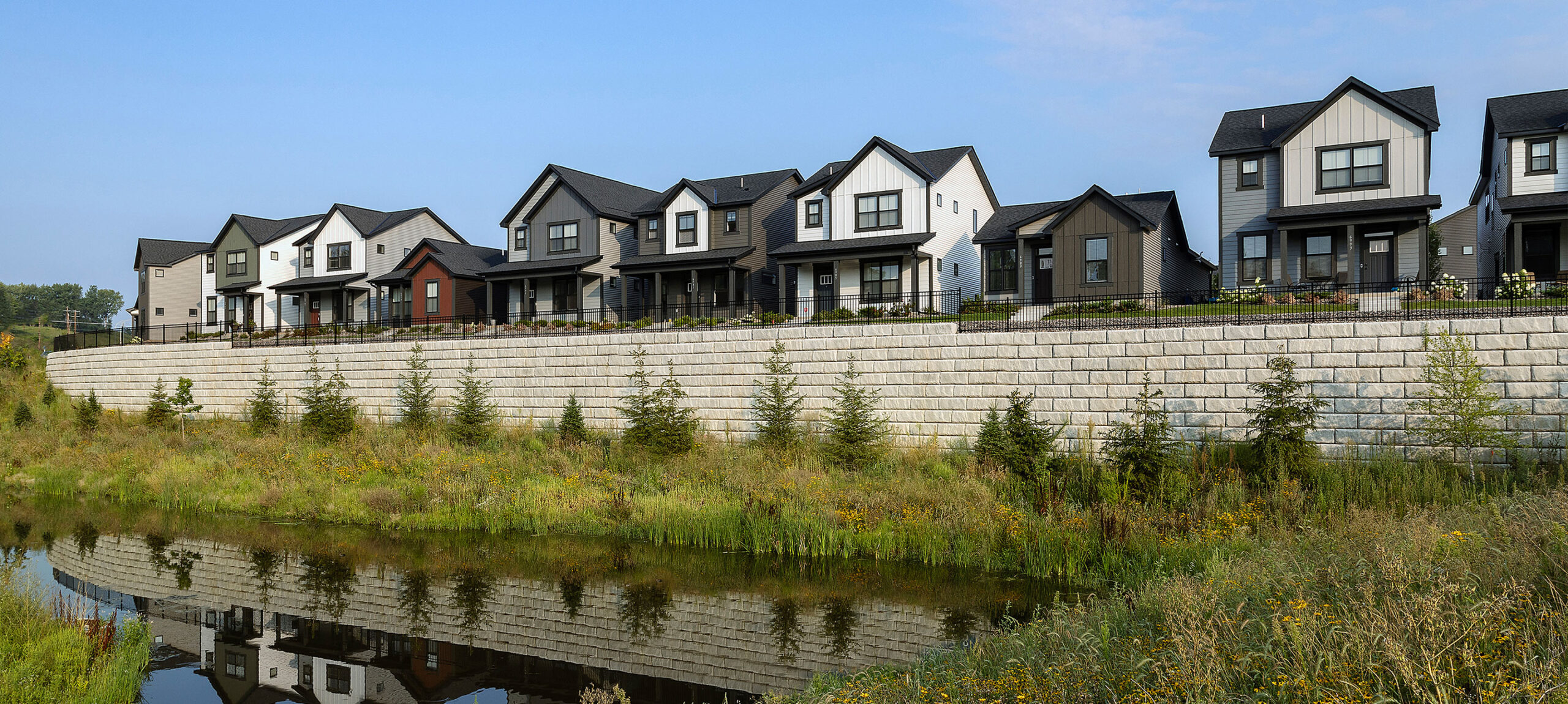
Great design is the foundation for great curb appeal. But it’s necessary to complete the design process with careful thought about appropriate, budget-friendly materials and details. This is the icing on the cake, and without it, much of the hard work you did to design a great home could be missed.
Material selections, details and color have a huge impact on curb appeal in the production-built environment.
Materials & Colors
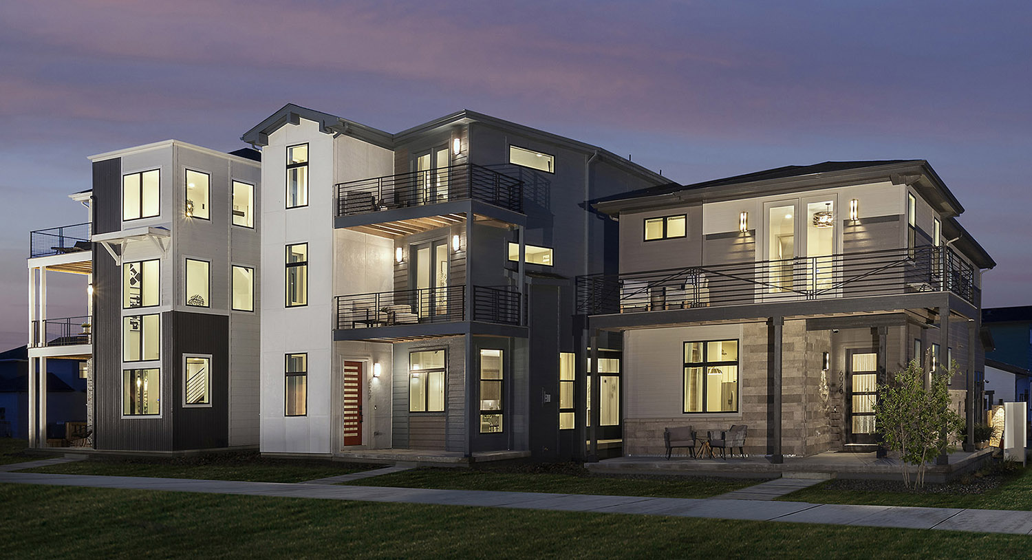
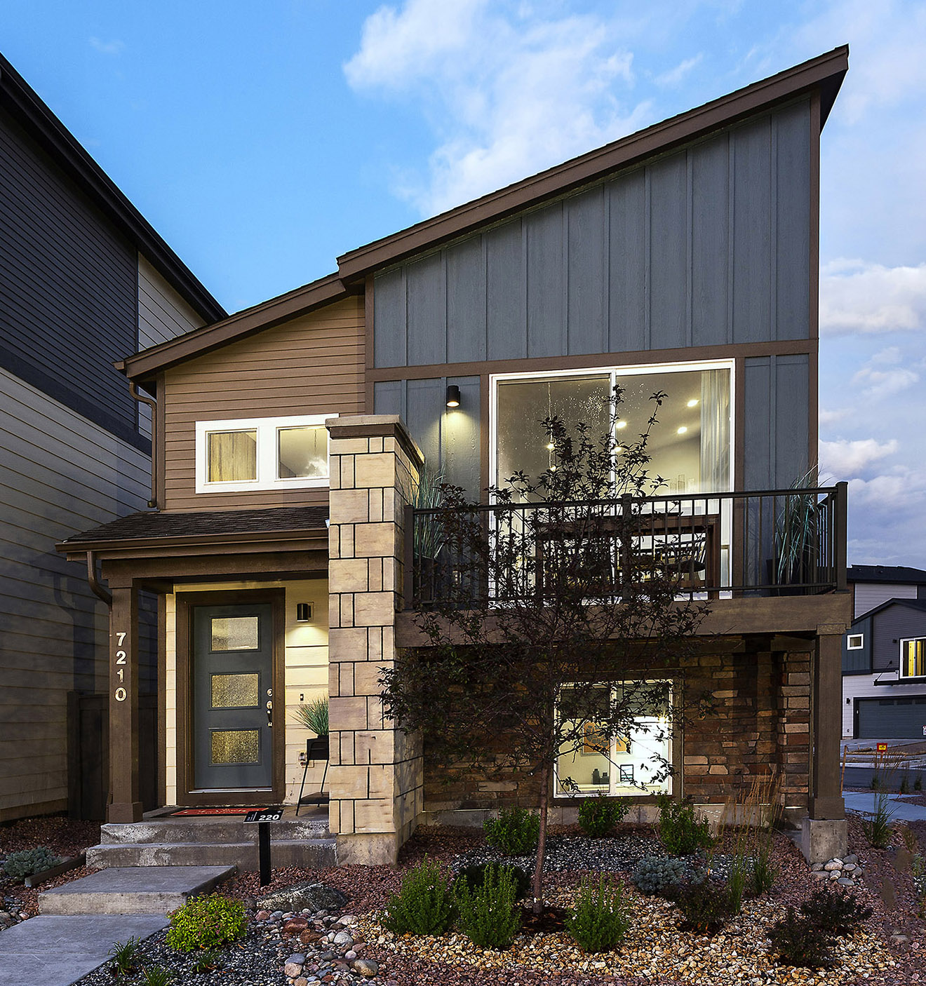 Here in Denver, buyers prefer a wide range of architectural styles, and Colorado homes are often clad with siding, stone or stucco in a variety of colors. But in every region, stylistic materials and colors can make a good elevation look great. Earthy base tones, bold accent colors, complementary materials and thoughtful accents all work together to create amazing curb appeal that will highlight the distinctive architecture of your homes.
Two Colors are Often Better Than One
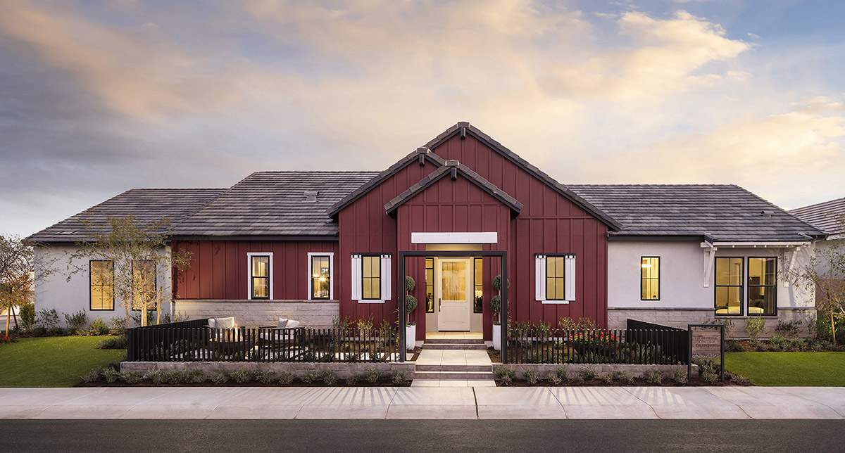
Sure, the ubiquitous Modern Farmhouse in all its stark white glory seems to be the reigning king of style for the past few years. But almost every other style out there can benefit from a two-color scheme. A grounded primary color and complementary accent color work in tandem to highlight the architectural details of the design while fitting the historic (or modern) aesthetic as intended.
For even more striking use of color, experiment with garage doors and entry doors. The pop of interest they provide can really tie together the entire palette. And don’t forget about shingles. In asphalt, blacks, grays and browns are most common, but I’ve used green and even deep red asphalt shingles to complement the overall color scheme of a community.
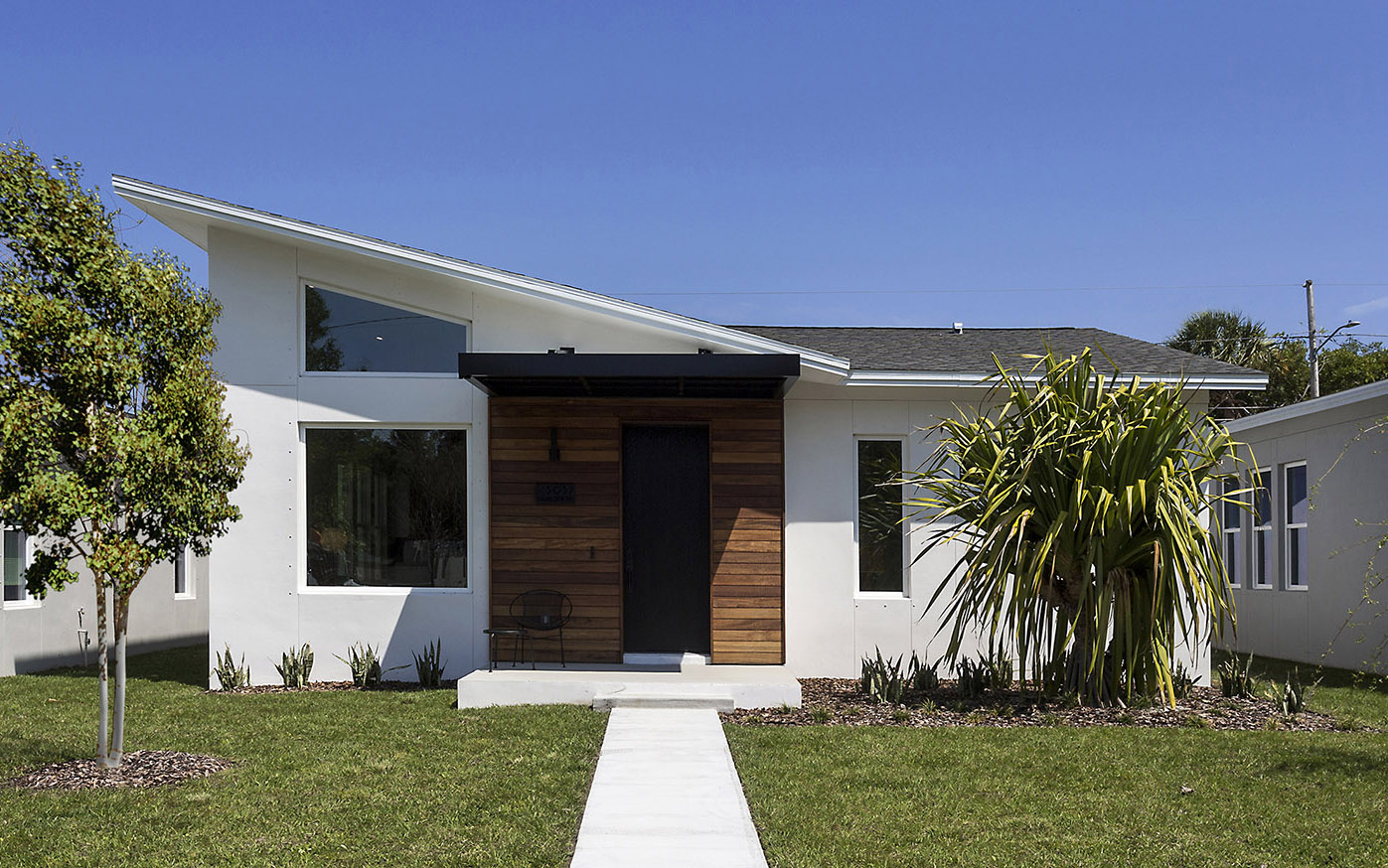
For styles that traditionally limit the use of color on primary massing, find other ways to use color for interest. For example, many southwestern styles use tans and browns that reflect their desert surroundings. Rich wood timbers on overhangs, bright entry doors, and even lighting fixtures and door hardware can introduce simple, eye-catching bits of color to this traditional monotone look.
Rethink That Stone Wainscot
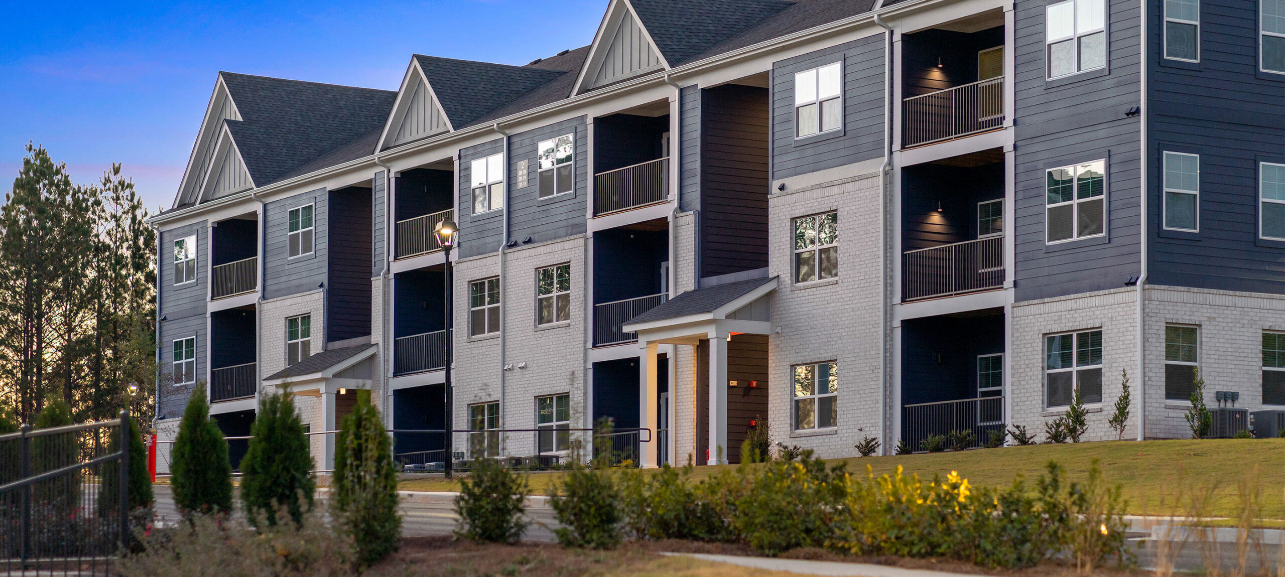
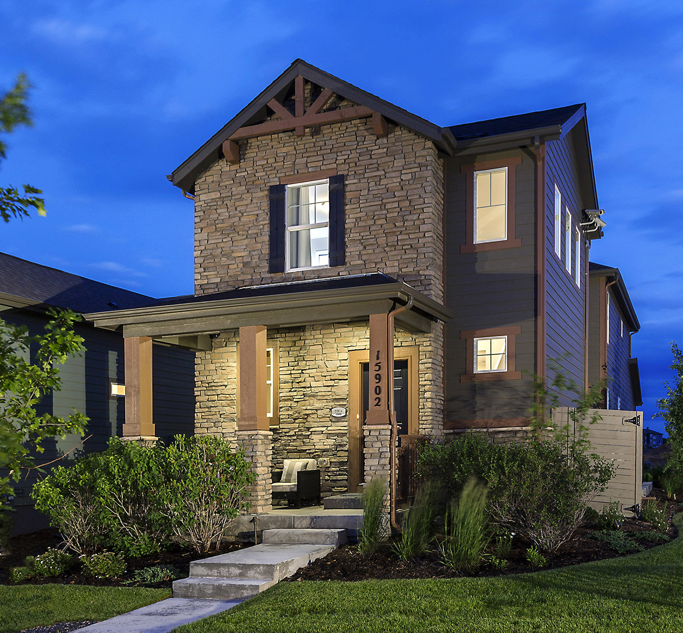 One of the best ways to achieve authenticity in an elevation is to use varied cladding. Unfortunately, many HOAs and municipalities have taken the “design sensitivity” out of cladding variety by mandating certain percentages of stone, brick, etc. This has created the ever-prevalent stone wainscot found in suburban neighborhoods across the country.
Stone is not cheap, and after a few years, most of that stone wainscoting might be fully obscured by landscape plantings. But there is a better way.
Instead of stretching a thin band of stone across the entire front of the home just to hit the required percentage, choose a strategic massing element and clad it top to bottom with stone. The expense is the same, but the impact is dramatically improved. Using the stone en masse and where it can be seen (even after the landscaping gets a bit overgrown) is a much better use of your materials budget.
Accent Siding
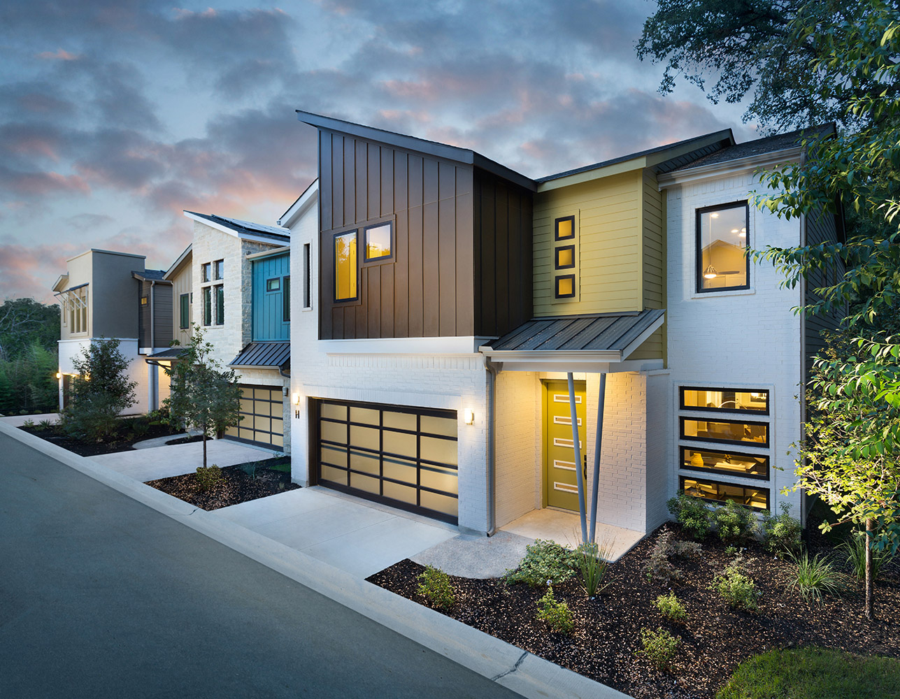 Regardless of material, today’s siding manufacturers provide endless options for accents. Scalloped, shingle-style, vertical board and batten, and panelized options exist in cementitious, vinyl, Hardie and others. When style appropriate, using these accent sidings in an elevation can really add interest.
I prefer to keep materials changes at inside corners only, which helps ease the transition. For this reason, I often apply accent siding to gable peaks or bump-outs, which already naturally draw the eye. The additional interest of accent siding (consider an accent color, too) can really enhance the impact of these architectural details.
Other Materials and Details
Here’s my opinion on how to maximize the effect of a few commonly used accent elements.
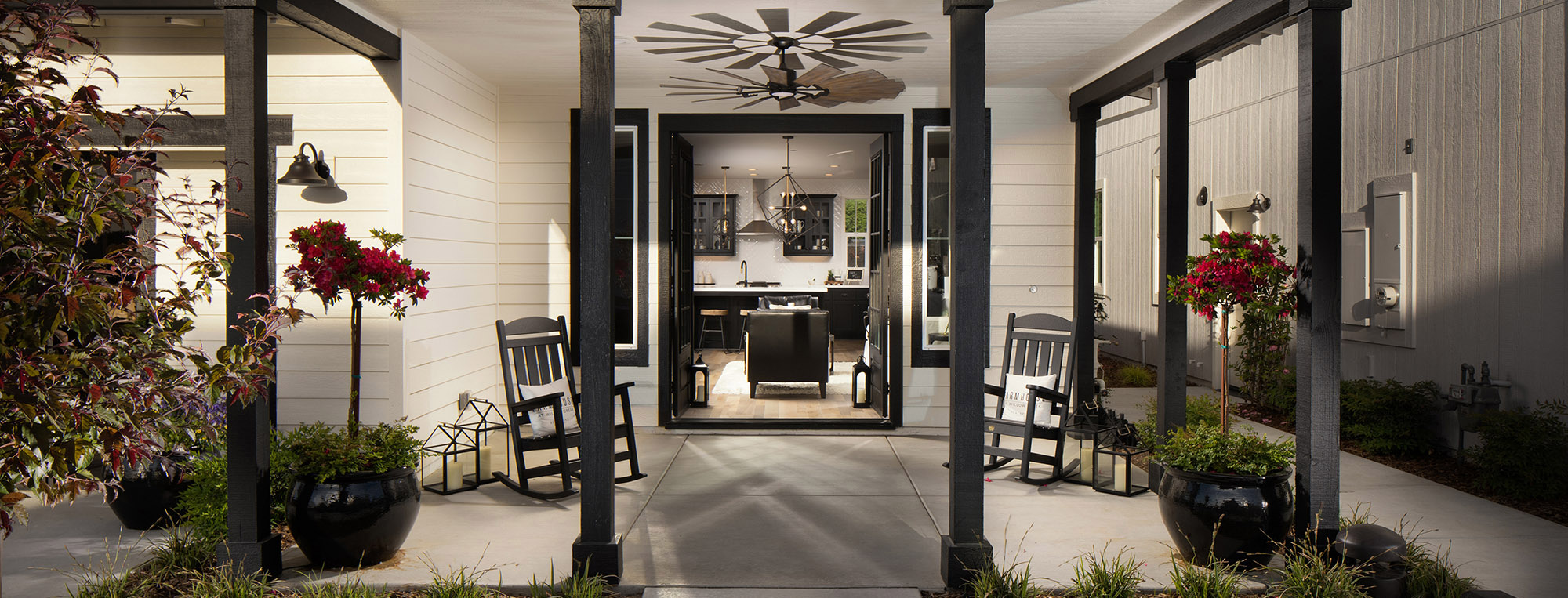
- Front Doors & Garage doors – Use designs that match your architectural style, and don’t be afraid to use some bold contrast in color. Simple hardware can go a long way, too.
- Brackets & Details – A few is enough, but don’t skimp on size. Three appropriately-scaled brackets look way better than 10 tiny ones.
- Exterior lighting – When the program allows, consider enhanced exterior fixtures that vary based on home style. Instead of hanging the same builder-grade carriage light at each front door, branch out a little.
- Awnings & Add-ons – When used, feature a metal roof or additional details. Think about functionality, too, so awnings and window boxes look and feel usable.
- Shutters – Another great place for secondary or accent color. Just make sure they are style appropriate, sized correctly and large enough to cover the entire window.
That’s a Wrap
Great color applied to authentic cladding with appropriate accent materials and details will help even the simplest elevation designs stand out in the crowd. Production builders who invest just a bit more than their competitors will create an exponentially better street presence that is sure to win buyers.
Designing homes more affordably has always been the key to attracting more homeowners. Offering great curb appeal will get them through the front door.
This article was originally posted on LinkedIn. View that version here.
